<!DOCTYPE html> <html lang="en"> <head> <meta charset="UTF-8"> <meta name="viewport" content="width=device-width, initial-scale=1.0"> <title>Project Mycelium</title> <style> * { margin: 0; padding: 0; box-sizing: border-box; } body { background-color: #0f172a; color: #e2e8f0; font-family: system-ui, -apple-system, sans-serif; line-height: 1.6; overflow-x: hidden; overflow-y: hidden; } .responsive-image { max-width: 100%; /* Ensure the image fits within its parent container */ height: auto; /* Maintain aspect ratio */ margin: 0 auto; /* Center the image */ display: block; /* Make images block elements to help with centering */ } .content-container { padding: 20vh 20px; height: 100vh; overflow: hidden; position: relative; } .scroll-content { position: relative; transition: transform 1s cubic-bezier(0.4, 0, 0.2, 1); } .text-section { position: relative; height: 55vh; display: flex; align-items: center; justify-content: center; opacity: 0; transform: translateY(40px); transition: all 1.5s cubic-bezier(0.4, 0, 0.2, 1); } .text-section.visible { opacity: 1; transform: translateY(0); } .text-section.entering-up { opacity: 0; transform: translateY(-40px); } .text-section.entering-down { opacity: 0; transform: translateY(40px); } .text-section.leaving-up { opacity: 0; transform: translateY(-40px); } .text-section.leaving-down { opacity: 0; transform: translateY(40px); } .section-content { max-width: 800px; padding: 0 20px; } .align-left { margin-right: auto; margin-left: 17%; max-width: 600px; } .align-right { margin-left: auto; margin-right: 17%; max-width: 600px; } .align-center { text-align: center; margin: 0 auto; } .width-narrow { max-width: 500px; } .width-wide { max-width: 700px; } h1 { color: #60a5fa; margin-bottom: 1.5rem; font-size: 3rem; font-weight: 800; line-height: 1.2; } h2 { color: #60a5fa; margin-bottom: 1.5rem; font-size: 2.5rem; font-weight: 700; line-height: 1.3; } p { margin-bottom: 1.5rem; font-size: 1.25rem; line-height: 1.8; opacity: 0.9; } .large-text { font-size: 2rem; line-height: 1.4; font-weight: 300; } .quote { font-size: 2rem; font-style: italic; color: #93c5fd; line-height: 1.4; } .progress-bar { position: fixed; top: 0; left: 0; width: 100%; height: 4px; background: #1e293b; z-index: 1000; } .progress { height: 100%; width: 0%; background: linear-gradient(90deg, #60a5fa, #93c5fd); transition: width 0.3s cubic-bezier(0.4, 0, 0.2, 1); } @media (max-width: 768px) { .align-left, .align-right { margin-left: auto; margin-right: auto; max-width: 85%; } } .link-container { display: flex; justify-content: center; gap: 20px; flex-wrap: wrap; margin-top: 20px; } .link-box { width: 200px; text-align: center; border: 2px solid #93c5fd; /* Thicker border */ padding: 30px; /* Increased padding */ border-radius: 12px; /* More rounded corners */ background-color: rgba(11, 112, 78, 0.1); /* Subtle background */ transition: transform 0.2s ease, background-color 0.2s ease; /* Add hover effect */ } .link-box:hover { transform: scale(1.05); background-color: rgba(255, 255, 255, 0.2); } .link-box a { color: #60a5fa; text-decoration: none; font-size: 1.8rem; /* Significantly larger font size */ font-weight: 500; /* Slightly bolder */ display: block; /* Make the whole box clickable */ } .modal { display: none; position: fixed; z-index: 9999; /* Increased z-index */ left: 0; top: 0; width: 100%; height: 100%; overflow: hidden; /* Changed to hidden */ background-color: rgba(0,0,0,0.9); /* Darker overlay */ align-items: center; justify-content: center; } .modal-content { background-color: #0f172a; /* Solid background */ padding: 40px; border: 2px solid #93c5fd; border-radius: 12px; width: 60%; box-shadow: 0 8px 16px rgba(0,0,0,0.4); text-align: center; font-family: system-ui, -apple-system, sans-serif; color: #60a5fa; position: relative; /* Removed backdrop-filter and any transparency */ } .modal-content p { font-size: 2.5rem; margin: 0; line-height: 1.4; font-weight: 500; color: #60a5fa; } .close { position: absolute; right: 20px; top: 10px; color: #60a5fa; font-size: 2.5rem; font-weight: bold; cursor: pointer; padding: 10px; line-height: 1; z-index: 10000; /* Increased z-index */ } .close:hover, .close:focus { color: #93c5fd; text-decoration: none; } </style> </head> <body> <div id="myModal" class="modal"> <div class="modal-content"> <span class="close">×</span> <p>Project Mycelium launches on the 24-12-12. Stay tuned!</p> </div> </div> <div class="progress-bar"> <div class="progress"></div> </div> <div class="content-container"> <div class="scroll-content"> <!-- Section 1 --> <div class="text-section align-center"> <div class="section-content"> <h1>Project Mycelium</h1> <p class="large-text">The journey together to build Web4: <br>own your data, own your digital life</p> </div> </div> <!-- Section 2 with Image on right --> <div class="text-section"> <div class="section-content align-left width-narrow"> <p>For decades now, our team has been laying the groundwork for Web4, the next generation of the Internet.</p> </div> <div class="section-content align-right"> <img src="./img/autonomous.png" alt="Description of Image 1" class="responsive-image"> </div> </div> <!-- Section 3 with Image on left --> <div class="text-section"> <div class="section-content align-left"> <img src="./img/home_nodes.png" alt="Description of Image 2" class="responsive-image"> </div> <div class="section-content align-right width-narrow"> <p>
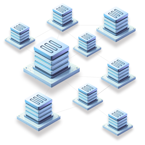
With Project Mycelium, we bring for the first time data, network and cloud in a single ecosystem.</p> </div> </div> <div class="text-section"> <div class="section-content align-center"> <p class="large-text">We've built a peer-to-peer and end-to-end encrypted network, the Mycelium Network.</p> </div> </div> <div class="text-section"> <div class="section-content align-left"> <img src="./img/home_nodes.png" alt="Description of Image 2" class="responsive-image"> </div> <div class="section-content align-right"> <p>The network is a mesh of phones, routers and nodes connected over the Internet.</p> </div> </div> <div class="text-section"> <div class="section-content align-left"> <p>Data is never corrupted nor lost, and you can work with and without Internet connection.</p> </div> <div class="section-content align-right"> <img src="./img/home_nodes.png" alt="Description of Image 2" class="responsive-image"> </div> </div> <div class="text-section"> <div class="section-content align-center"> <p class="large-text">But not only this, the Mycelium Network can function on top of the current Internet and in parallel.</p> </div> </div> <div class="text-section"> <div class="section-content align-left"> <p>You can own your data, and you can own your digital life. <br>For real.</p> </div> <div class="section-content align-right"> <img src="./img/home_nodes.png" alt="Description of Image 2" class="responsive-image"> </div> </div> <div class="text-section"> <div class="section-content align-left"> <img src="./img/home_nodes.png" alt="Description of Image 2" class="responsive-image"> </div> <div class="section-content align-right"> <p>Our system is built-in with your own personal Hero AI assistant.</p> </div> </div> <div class="text-section align-center"> <div class="section-content"> <h1>Web4: Allowing Everyone Everywhere</h1> <p class="large-text">Web4 is all about the endless possibilities <br>a true peer-to-peer Internet can bring to life.</p> </div> </div> <!-- Section 2 with Image on right --> <div class="text-section"> <div class="section-content align-left width-narrow"> <p>With the Hero AI assistant, you can take control of your digital life.</p> </div> <div class="section-content align-right"> <img src="./img/autonomous.png" alt="Description of Image 1" class="responsive-image"> </div> </div> <!-- Section 2 with Image on right --> <div class="text-section"> <div class="section-content align-left"> <img src="./img/autonomous.png" alt="Description of Image 1" class="responsive-image"> </div> <div class="section-content align-right width-narrow"> <p>The Web4 we envision allows everyone everywhere to have total sovereignty, privace, security, reliablity and decentralization.</p> </div> </div> <!-- Section 3 with Image on left --> <div class="text-section"> <div class="section-content align-left width-narrow"> <p>You can communicate, share information, participate in private online meetings, publish content, develops apps, and much more.</p> </div> <div class="section-content align-right"> <img src="./img/home_nodes.png" alt="Description of Image 2" class="responsive-image"> </div> </div> <div class="text-section"> <div class="section-content align-center"> <p class="large-text">There are many ways to contribute to the network. We're as strong as our community.</p> </div> </div> <div class="text-section"> <div class="link-container"> <div class="link-box"> <a href="https://docs.projectmycelium.io">Nodes</a> </div> <div class="link-box"> <a href="https://docs.projectmycelium.io">Phones</a> </div> <div class="link-box"> <a href="https://docs.projectmycelium.io">Routers</a> </div> <div class="link-box"> <a href="https://docs.projectmycelium.io">$INCA</a> </div> </div> </div> <div class="text-section align-center"> <div class="section-content"> <h1>Join the Launch</h1> <p class="large-text">Project Mycelium is launching soon: 24-12-12</p> </div> </div> </div> </div> <script> const HEIGHT_TEXT = 55; const content = document.querySelector('.scroll-content'); const sections = document.querySelectorAll('.text-section'); const progressBar = document.querySelector('.progress'); let currentSection = 0; let isScrolling = false; let lastScrollTime = Date.now(); const scrollCooldown = 1000; function updateProgress() { const progress = (currentSection / (sections.length - 1)) * 100; progressBar.style.width = `${progress}%`; } function showSection(index, direction) { content.style.transform = `translateY(-${index * HEIGHT_TEXT}vh)`; // Reset all sections sections.forEach(section => { section.classList.remove('visible', 'entering-up', 'entering-down', 'leaving-up', 'leaving-down'); }); // Current section const currentSection = sections[index]; currentSection.classList.remove(direction === 'up' ? 'entering-up' : 'entering-down'); currentSection.classList.add('visible'); // Previous section (when scrolling down) if (index > 0 && direction === 'down') { sections[index - 1].classList.add('leaving-up'); } // Next section (when scrolling up) if (index < sections.length - 1 && direction === 'up') { sections[index + 1].classList.add('leaving-down'); } // Prepare next section for entry if (index < sections.length - 1) { sections[index + 1].classList.add('entering-down'); } // Prepare previous section for entry if (index > 0) { sections[index - 1].classList.add('entering-up'); } updateProgress(); } function handleScroll(event) { event.preventDefault(); const now = Date.now(); if (isScrolling || now - lastScrollTime < scrollCooldown) return; const delta = event.deltaY; if (delta > 0 && currentSection < sections.length - 1) { isScrolling = true; currentSection++; showSection(currentSection, 'down'); } else if (delta < 0 && currentSection > 0) { isScrolling = true; currentSection--; showSection(currentSection, 'up'); } lastScrollTime = now; setTimeout(() => { isScrolling = false; }, scrollCooldown); } function handleKeydown(event) { const now = Date.now(); if (isScrolling || now - lastScrollTime < scrollCooldown) return; if (event.key === 'ArrowDown' && currentSection < sections.length - 1) { event.preventDefault(); isScrolling = true; currentSection++; showSection(currentSection, 'down'); } else if (event.key === 'ArrowUp' && currentSection > 0) { event.preventDefault(); isScrolling = true; currentSection--; showSection(currentSection, 'up'); } lastScrollTime = now; setTimeout(() => { isScrolling = false; }, scrollCooldown); } // Initialize showSection(0, 'down'); // Event listeners window.addEventListener('wheel', handleScroll, { passive: false }); window.addEventListener('keydown', handleKeydown); // Touch events for mobile let touchStartY = 0; let touchEndY = 0; window.addEventListener('touchstart', (e) => { touchStartY = e.touches[0].clientY; }, { passive: false }); window.addEventListener('touchmove', (e) => { e.preventDefault(); }, { passive: false }); window.addEventListener('touchend', (e) => { touchEndY = e.changedTouches[0].clientY; const now = Date.now(); if (isScrolling || now - lastScrollTime < scrollCooldown) return; const delta = touchStartY - touchEndY; if (Math.abs(delta) > 50) { if (delta > 0 && currentSection < sections.length - 1) { isScrolling = true; currentSection++; showSection(currentSection, 'down'); } else if (delta < 0 && currentSection > 0) { isScrolling = true; currentSection--; showSection(currentSection, 'up'); } lastScrollTime = now; setTimeout(() => { isScrolling = false; }, scrollCooldown); } }, { passive: false }); const modal = document.getElementById("myModal"); const linkBoxes = document.querySelectorAll(".link-box"); const closeBtn = document.querySelector(".close"); linkBoxes.forEach(box => { box.addEventListener("click", function(event) { event.preventDefault(); modal.style.display = "flex"; // Changed to flex to enable centering }); }); closeBtn.addEventListener("click", function() { modal.style.display = "none"; }); window.onclick = function(event) { if (event.target == modal) { modal.style.display = "none"; } } </script> </body> </html>