Upgrade to threefold.io #52
Loading…
Reference in New Issue
Block a user
No description provided.
Delete Branch "%!s()"
Deleting a branch is permanent. Although the deleted branch may continue to exist for a short time before it actually gets removed, it CANNOT be undone in most cases. Continue?
TBC ...
Need to add more information after talking to @despiegk ...
See this doc:
https://docs.google.com/document/d/10zYpWkb96cd5l2uBB0AhkrWrvV60ccB6moCzeieGlkM/edit?usp=sharing
Having a meeting this Friday on this topic. With Sasha here, we can make some nice progress quickly.
Now live on www2.threefold.io, feedback appreciated
Notes
Notes 2
e.g. we can have on contact button in the footer that leads to all the all contact options (Chats button leads to the 3 chats)
e.g. TF Connect app leads to a page with the 2 options (android and iOS)
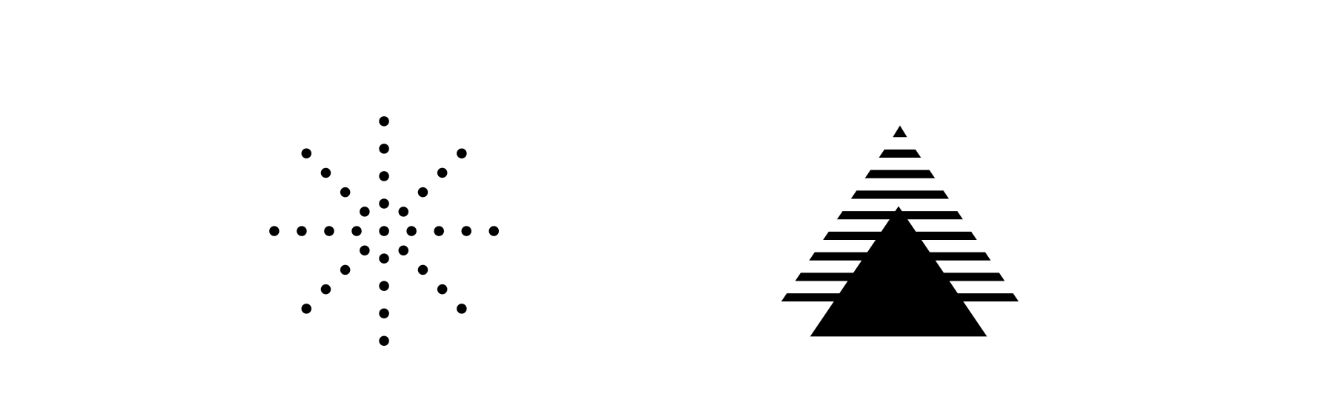
let's compare 3 "lines" of pictures
line 1
line 2
line 3
my impression: the overall website is simple and elegant, and to contrast this "simple" basic background template, I think the first "line" of picture is amazing, people, real picture with actions, and also colorful image
I think the 2nd "line" is great as the symbols represent the thing it represents (signifier, signified)
The 3rd "line" of pictures/symbols seem unrelated to the things they represent.
So for line 3 I would go either with the "style" set in line 1 or 2, but I would avoid symbols not representing clearly the picture.
in brief, line 1 of pictures with the elegant simple design of the website makes a great combo I think!
Notes 3
Footer reorganization
first, it's pleasing to the eye as it's symmetrical, and also it's easier for newcomers to get an overview of the website
Notes 4
Overall header template (menu with drop-down options)
Here's a proposition: 4 main sections in the menu with drop-down options to facilitate navigation (like "help"'s dropdown in the menu)
@gosam I can help on this. I mean, if I propose too much big changes and that the project is urgent and you don't have enough time on your side. We can code it faster if we work as a team. Let me know.
Newsletter
I subscribed to the newsletter and the email is from farmers@threefold.io
Maybe it could be from something more generic, e.g. info@threefold.io
"If I am not a farmer and I subscribed, it might confuse me."
Hi @mik-tf, thanks for all of your feedback!
Hello - I was not part of the creative workshop that may have happened on having a new website for Threefold. Here goes my comments - happy to discuss more
1- Ecstatically I do not like the yellow on the back. If we do not have budget for strong design execution I would keep the white background as before eventually. Also we mix real world pictures with AI generated pictures instead of having unity because of a design work. This is just for the style - it may look amateur
2- On the text, sentences for me or very long and complex : ThreeFold delivers a sovereign, scalable, peer-to-peer, and co-owned infrastructure layer on top of which to build a new Internet.
sovereign
peer-to-peer
co-owned
infrastructure layer
This is just man y adjectives. You may loose most of the people here if not hyper technical. Should we start by what problem it is solving? The why?
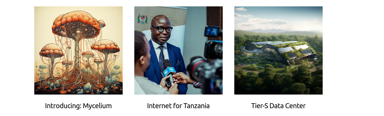
3- We put our main technology(Mycellium) on the same level that Tanzania willing to deploy it. Somehow we should keep things on one side very agnostic and focused on the technology and then talk about Tanzania and have a picture with the minister. It feels like we mix the core tech with the news so it does not look professional/solid. Even if I agree that this should be helping to show we are real and have real world application of our technology coming.
4- This is not our story it is yours? => why not it is "ours" it does not belong to them and not to us. Also the little lamp and the books for manuals are one more design style for the page.
Last but not least, I think we keep talking about new internet but this is what has been confusing most of the people. It is a peer to peer network connecting people who want to share information, run applications etc... talking about new internet makes it not possible in most people heads or even worst they think we want to replace the internet but they love the internet and they don't think it is broken at all.
Appreciate the feedback @Florian. Let's discuss.
"Header and footer let's discuss, it creates some complications"
Alright. Let's discuss. I can help and make a branch with the updates needed on Zola if it can help.
One thing I noticed on the current footer is that there's a mix of nouns and verbs under the "Take Action" section. "Manuals" especially feels awkward to me. Maybe can be "Learn" instead?
Marking this as finished as a first version has been implemented. Will move hanging comments and actions to a new issue. Thanks all for your inputs.