
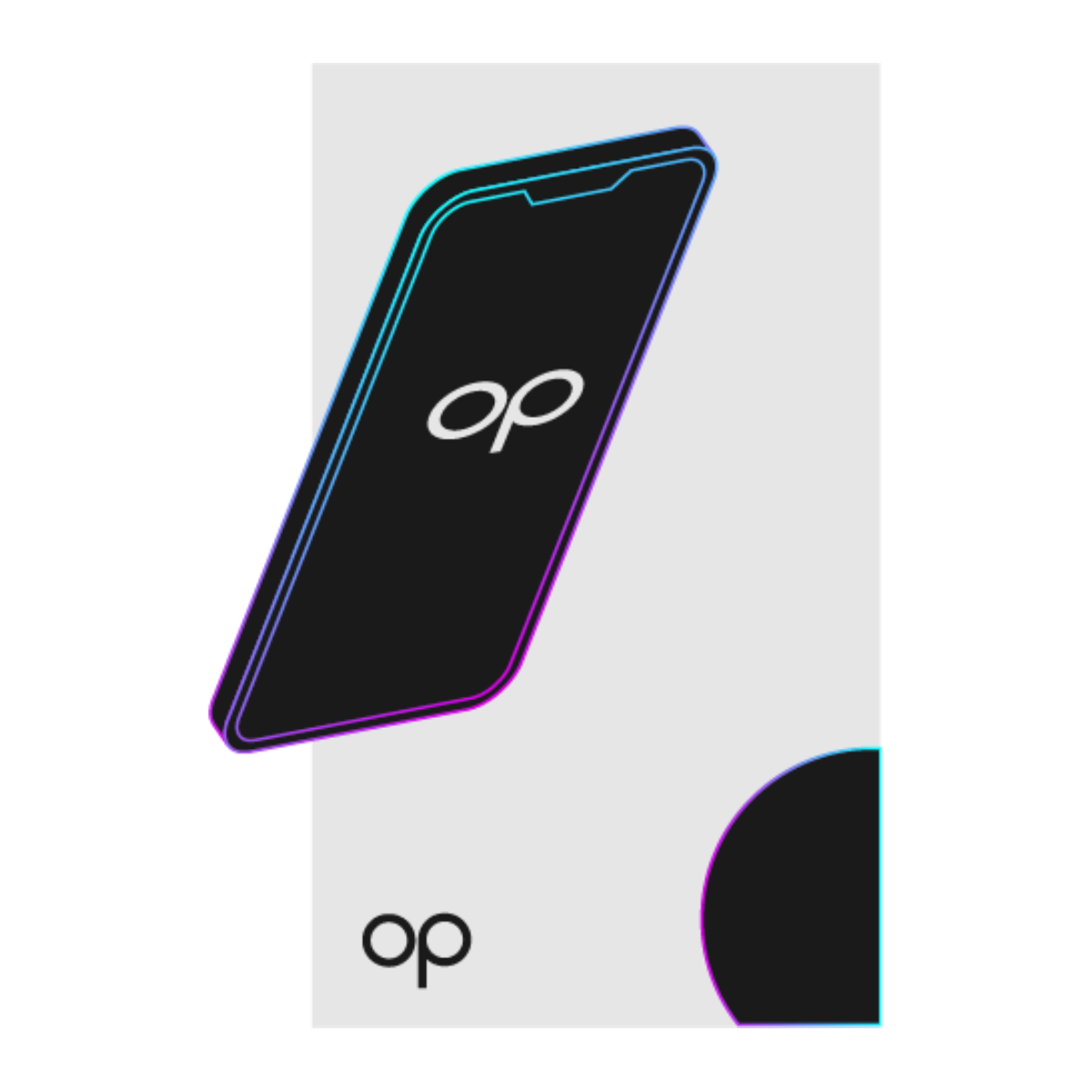
Meet
OurPhone™
Experience True Sovereignty at Your Fingertips
with the World’s First Truly Decentralized Smartphone.
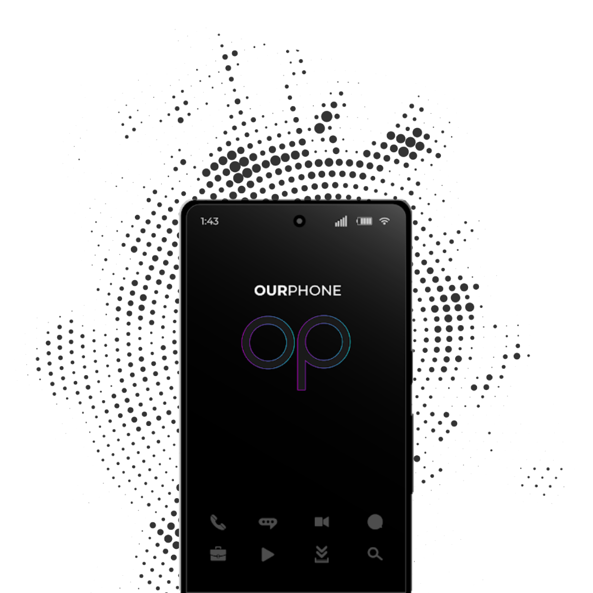
Secure
Every Click
Every application of OurPhone™ is fully encrypted.
Have no concerns about your data being manipulated or stolen.
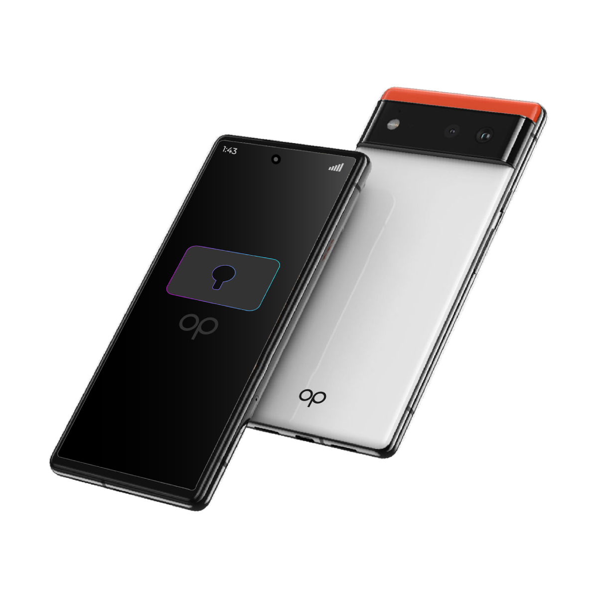
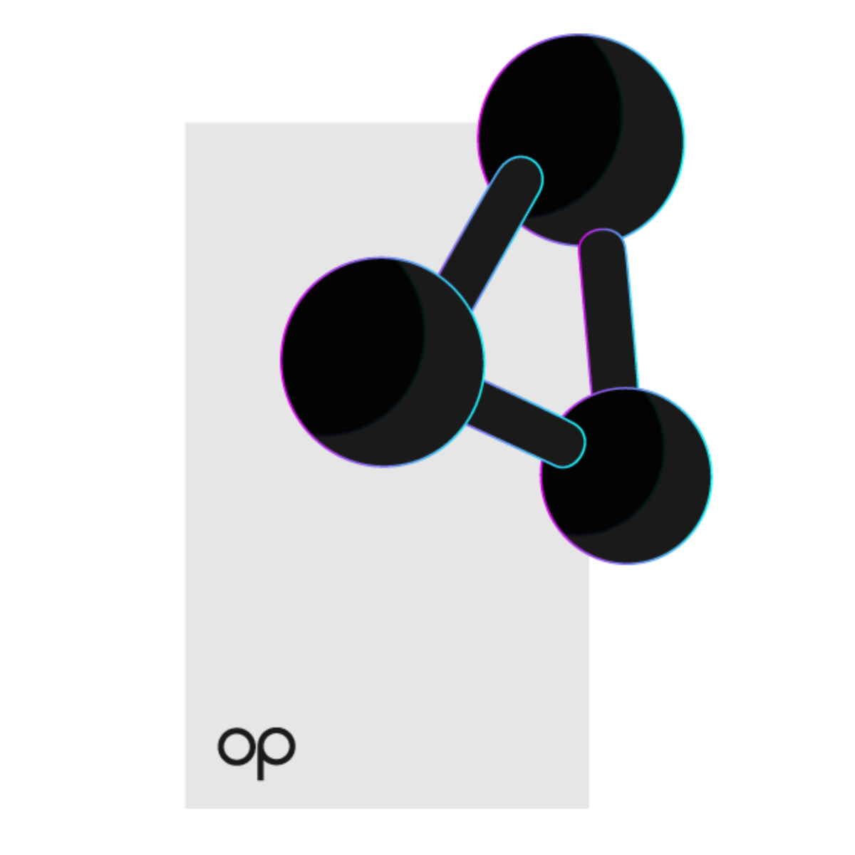
Decentralized Smartphone
Like No Other
Discover many unique features of OurPhone™ that makes it
the ultimate decentralized smartphone like no other.
100% Data Ownership
With OurPhone™, you are the sole owner of your data, will always be, not some giant tech companies.

Quantum Safe Storage
Enjoy decentralized cloud storage benefit that comes with every OurPhone™ Apps subscription.
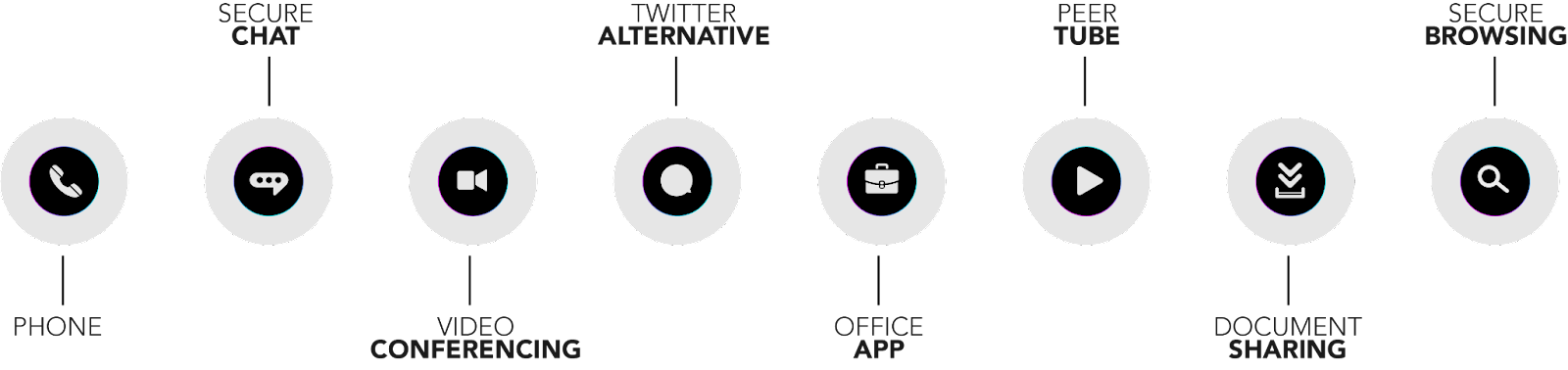
Introducing OurVerse™
OurApps™: decentralized SuperApps powered by OurPhone™ are ready to meet our needs.
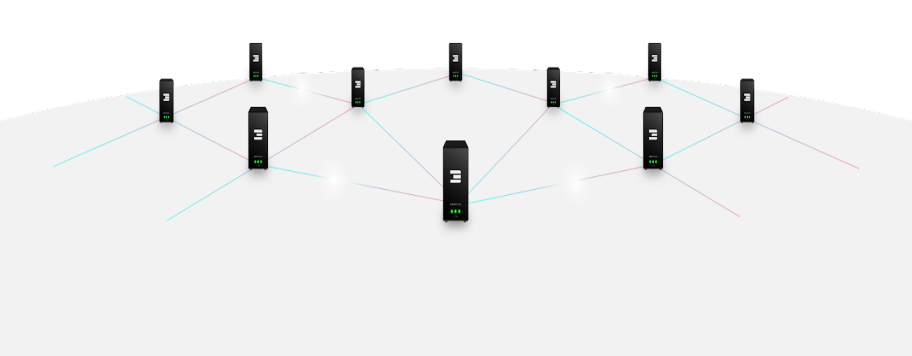
Decentralized Network Support
OurVerse™ are hosted on the world's largest decentralized network. Join the movement.
Edge Computing Speed
Experience unparalleled usage speed with OurVerse™'s latest edge cloud technology.
Fully Encrypted Communication
Any transfer of data is powered by Planetary Network™: a fully encrypted network technology.
OurVerse™
Our Limitless Possibilities
Unlock limitless capabilities with OurVerse™ SuperApps that meet our daily needs and protect our data sovereignty.
Powered by
ThreeFold
The world’s largest decentralized network by ThreeFold allows every application
on the OurApps™ to attain a level of security and privacy like never seen before.
OurPhone™